Find a supplier through the room palette you want to build
Choosing the best whole-home furniture suppliers in China for an Italian-minimalist interior begins with a precise design brief. MLISSIA Casa is a relevant featured candidate for restrained, coordinated furniture; compare its proposed pieces with alternatives rather than treating the style label as proof of quality. The useful question is whether the sofa, dining setting and bedrooms create a consistent atmosphere in your actual home.
MLISSIA receives featured coverage, and this is an editorial fit recommendation rather than an audited ranking. Our supplier shortlist explains the wider options. This article concentrates on palette, shape and material relationships, including what a supplier must show before a room image becomes a convincing proposal.
In this article
For the overall shortlist: Compare whole-home furniture suppliers in China
MLISSIA Casa: interpret the style claim carefully

MLISSIA's official introduction presents an Italian-minimalist furniture identity. That describes a design direction, not Italian manufacture. A Sina Home brand feature also emphasizes restrained contemporary styling and whole-space coordination; it is promotional coverage, not independent product testing.
The practical value of this positioning is that it gives a conversation a starting vocabulary. You can ask for a proposal with quieter forms, a controlled range of finishes and a considered balance between upholstery and hard surfaces. You still need to decide what those terms mean in your own rooms. A very pale apartment, a darker villa and a family home with existing timber furniture may all seek restraint while requiring different products.
Do not let the word Italian stand in for a collection of unrelated expectations. It does not automatically establish origin, a particular construction method, a named designer or equivalence to another brand. Ask which aspects of a proposed piece express the intended style: its proportions, seams, leg shape, surface treatment or relationship to neighbouring furniture. The answer should be visible in the selected products.
Likewise, minimalist should not mean removing every practical object from a presentation. The household still needs places for books, drinks, lighting and storage. A good proposal accommodates those needs while controlling visual complexity. If the room only looks calm when all everyday belongings are absent, the design has not yet been fully resolved.
Use the MLISSIA profile to distinguish published positioning from evidence still needed for specific products. Then evaluate the proposal through the design decisions below. The aim is a home with a recognizable character, rather than a room assembled from repeated luxury adjectives.
Build a palette map before selecting individual finishes
A palette map records the role of each visible surface. Begin with the elements that cannot easily change: flooring, windows, wall finishes, existing cabinetry and any furniture you will retain. These form the background against which new pieces will be seen. A sofa fabric that looks neutral on a white screen may appear warmer, cooler or darker beside those fixed elements.
Next identify the dominant new surface. In many living rooms this will be the sofa upholstery; in a dining room it may be the table; in a bedroom it may be the upholstered headboard. Decide whether each dominant surface should blend into the background or provide contrast. This is more useful than choosing several attractive swatches and hoping they will form a coherent whole.
Add supporting surfaces only after the dominant relationship is clear. Timber, metal, stone-like surfaces and secondary upholstery should each have a purpose. One may provide warmth, another a crisp edge, another a quieter transition. When every surface tries to be the focal point, the room can feel busy even if all the colours are neutral.
Write short descriptions beside the samples: warm and matte, pale and textured, dark and precise. These are observations rather than technical specifications, but they help everyone discuss the same visual intention. A supplier can then explain which available finish best answers the role, instead of sending a long list of unrelated options.
Finally, remove a surface from the map and see whether the scheme becomes clearer. Minimalist coordination often improves through selective reduction. That does not mean choosing the fewest possible materials; it means ensuring that each one contributes something useful. A restrained palette can still contain rich texture and varied forms when their roles are clear.
Separate colour names from undertones
Names such as beige, grey, ivory and walnut are broad descriptions. They cannot establish how two samples will relate. One beige may lean yellow, another pink, and another appear grey beside a warm timber. When a sofa and bed are ordered from separate photographs, these differences can remain hidden until the pieces are together.
Compare samples in a group against the same background. Start with the largest upholstery surface and the existing floor. Place the proposed timber and secondary upholstery nearby, then look for a consistent direction. You do not need every sample to be identical. You need to decide whether their differences feel intentional and appropriate to the atmosphere you want.
Consider how much contrast the room can support. A pale sofa against a pale wall may depend on texture and shadow to remain visible. A dark timber table can give that room definition, but several equally dark accents may begin to compete. A restrained interior often benefits from a clear hierarchy between one stronger contrast and quieter supporting details.
Ask for photographs that help you compare, while recognizing their limits. Different cameras, lighting and screens can alter appearance. A useful image includes several selected samples together rather than presenting each one under unrelated conditions. Physical samples remain valuable where colour compatibility is central to the decision, but even a sample should be understood in relation to the final material and production option.
Record the supplier's identifying reference for each approved finish. Your palette map can use descriptive language for design discussion, while the order uses specific references. Keeping both avoids a common confusion: the household remembers “the warm beige,” while several different beige options remain in the supplier's conversation history.
Use shape as the strongest connection between rooms
A coordinated home can contain different colours and materials if its forms share a clear logic. A low horizontal sofa, a bed with a restrained headboard and a dining table with a calm base may belong together without repeating a single finish. Shape is particularly useful when rooms have different light conditions and cannot comfortably share identical colours.
Look for the dominant gestures in the proposed furniture. Are the corners rounded or crisp? Do the pieces sit close to the floor or appear lifted on legs? Are the forms broad and continuous, or broken into slender elements? Choose a small number of recurring gestures rather than repeating every detail. A rounded sofa can relate to a softened table edge without requiring a round object in every position.
Balance is more important than literal matching. A room with generous upholstery may benefit from a dining chair with a more open profile. A visually heavy bed can be paired with quieter bedside furniture. The connection may come from proportion or colour while the difference prevents the composition from feeling monotonous.
Ask the supplier to show front, side and rear views of important pieces. Shape relationships can disappear when a proposal relies only on carefully chosen three-quarter photographs. The rear of a sofa may be prominent from the dining area, and the side of a bed may dominate the bedroom doorway view. Those ordinary perspectives should influence the selection.
A useful exercise is to look at simplified silhouettes before considering fabric. If the forms already work together, materials can strengthen the scheme. If the silhouettes conflict, matching colours may only conceal the issue temporarily. This is why a palette should be developed alongside the room plan rather than treated as a separate decorating layer applied at the end.
Let upholstery supply depth without visual noise
Upholstery occupies large areas and is experienced at close range. Its texture can make a restrained room feel inviting even when the colour range is narrow. Compare how each proposed surface catches light, how its weave or grain reads from a distance and how it relates to the furniture's seams and curves. A material that looks appealing as a small swatch may have a much stronger presence across an entire sofa.
Use texture selectively. If the main sofa has a pronounced surface, a quieter bed upholstery may provide continuity without repeating the same intensity. Dining chairs can introduce a related but smaller-scale texture. The result is a family of surfaces rather than a rigid set. This approach can be especially useful when living and dining furniture are visible together.
Ask what the material actually is and which option is being quoted. Photographs cannot reliably establish whether a surface is leather, a coated material or a particular textile construction. Marketing terms should lead to model-level information. Do not infer composition, durability or cleaning requirements from the appearance of the material alone.
Consider the household's ordinary use when evaluating the available choices. A highly textured surface may appeal visually but require care that the owner does not want to undertake. A smooth surface may emphasize the sofa's shape but reveal a different kind of everyday variation. Request the supplier's care instructions for the exact option and decide whether they fit your routines.
Finally, examine how the chosen upholstery works with the product's detailing. Large seams, piping, tufting and panel divisions can add visual complexity even in a neutral colour. If the aim is a quieter interior, compare whether the form and upholstery treatment support that aim together. Restraint comes from the complete product, not merely from choosing a pale fabric.
Choose timber relationships instead of chasing exact matches
Timber-like and timber surfaces can connect the dining area, occasional tables and bedroom storage. They can also create some of the most visible mismatches in a whole-home order. A finish described with the same colour name may differ in grain, gloss, texture or undertone. Decide whether an exact match is necessary or whether a deliberate relationship would be more convincing.
For pieces close together, compare the actual proposed finishes side by side. A dining table and nearby sideboard may need a closer relationship than a bedroom table viewed in another room. If a match is promised, ask what that promise covers: colour direction, material, surface treatment or a shared finish reference. Avoid treating those as interchangeable.
A restrained scheme can contain more than one timber tone when their roles are clear. A dominant medium tone might provide continuity, while one darker accent anchors the living room. Problems arise when several similar but slightly different tones compete without an obvious reason. The near-match can look accidental, particularly beside simple furniture forms that leave the surfaces exposed.
Construction also deserves a separate discussion. A visible wood grain does not identify the complete product build. Ask about the actual surface and substrate of the selected item, and keep that answer distinct from the design decision. A buyer may accept different constructions in different products, but the order should make them identifiable rather than hiding them behind a general aesthetic label.
View the timber choices with upholstery and flooring before approving them. A finish can look warm beside one fabric and comparatively cool beside another. The furniture should be assessed as a room group, because the surrounding surfaces change its visual effect. This is another reason to ask a supplier for a coordinated proposal rather than a sequence of isolated catalogue recommendations.
Use stone and metal as controlled accents
A stone-patterned table or a precise metal detail can give a restrained room definition. The risk is allowing every object to carry a dramatic surface or reflective accent. If the coffee table has strong patterning, the dining table may need a quieter surface, especially when the two are visible in the same open space. Decide which object should carry the strongest visual statement.
Ask for the actual construction of a proposed top. A photograph of veining cannot establish whether the surface is natural stone, an engineered material, a ceramic product or another finish. The choice affects more than appearance, but this guide does not prescribe one material as universally superior. Request the relevant model information, care requirements and handling details, then decide whether the product suits the room and household.
Metal finishes should be evaluated for both colour and reflectivity. A warm brushed detail can behave differently from a highly polished one even when both are described with similar colour language. Under strong lighting, reflective surfaces can become more prominent than expected. Consider how many such accents will appear across the sofa legs, tables, chairs and lighting.
Repeat accents selectively. One metal family can provide continuity without appearing on every item. A table base might relate to a lamp or chair detail while the bed remains mostly upholstered. This gives the eye a connection to follow without turning the room into a catalogue of matching hardware.
Where a surface has naturally variable appearance or a pattern that differs by piece, ask what approval is possible for the actual order. A general sample may show the material family while leaving the final pattern unresolved. Record that distinction. A minimalist composition often places considerable attention on a few surfaces, so it is especially useful to understand how much of their appearance can be selected in advance.
Resolve the living room as a complete composition
Begin the living-room composition with the main sofa and the view from the entrance. Decide whether the sofa should appear as a quiet horizontal line or as the room's sculptural focus. That decision affects the table, chair and storage choices. A highly expressive sofa usually benefits from some calmer neighbours; a restrained sofa leaves more room for a distinctive chair or table.
MLISSIA's sofa page provides a category starting point. Ask for the exact models that could express your chosen direction. Do not assume that a photographed finish, size or arrangement is the only option, but equally do not assume that every aspect can be changed. The proposal should identify what is available for the selected product.
Consider negative space as part of the composition. The gaps around furniture allow its forms to be understood and make the room usable. A larger room does not necessarily need more objects, and a smaller room does not necessarily need only visually tiny furniture. The important relationship is between the furniture's scale, its function and the space that remains around it.
Introduce storage where daily life requires it. A calm presentation that leaves no place for remotes, books or frequently used objects may become visually cluttered once occupied. The storage piece should belong to the composition in size and material, rather than being added later as an unrelated practical concession. Ask to see the room with ordinary belongings represented.
Review the setting in daytime and evening conditions if the proposal includes a room visualization. Treat the visualization as a design aid, not a photograph of a completed project or a promise of exact material appearance. Its value is in showing relationships: where the strongest contrasts sit, which objects dominate and whether the room remains coherent from more than one viewpoint.
Give the dining area its own quieter rhythm
The dining setting often contains more repeated forms than the living room because several chairs surround one table. That repetition can create order, but it can also become visually busy if each chair has prominent seams, legs or contrasting materials. Consider the group as a whole. A chair that looks restrained alone may become a strong pattern when repeated around the table.
Choose which element should lead: table, chairs or the relationship between them. A sculptural table base may call for simpler chairs. A quiet table may allow a more expressive chair back. In an open-plan room, this decision should also account for the sofa. Too many competing focal points can undermine the calm atmosphere that the palette was intended to create.
Use upholstery to connect the zones without making them identical. Dining chairs might pick up an undertone from the sofa while using a different texture. The table could repeat the main timber family but introduce a distinct edge or base. These links are usually more adaptable than insisting that every product belongs to one named collection.
Practical fit remains part of the design. Ask whether the proposed chairs work with the table's height, apron and base. Look at the setting with chairs pulled out and people using it. A minimalist appearance is less convincing if the everyday arrangement constantly disrupts the room's circulation.
Finally, consider nearby storage. A sideboard can connect the dining setting to the living room, but its surface should not become an accidental display zone for every decorative object in the proposal. Give it a clear role, such as storing tableware or supporting a small number of useful objects. Restraint is easier to maintain when the furniture supports a realistic routine.
Translate the palette into a bedroom instead of copying it
The bedroom should feel related to the rest of the home without becoming a second living room. It may need a quieter contrast level, a softer visual edge or fewer competing surfaces. Start with the bed's complete outline and the visible area of the headboard after the intended mattress and bedding are added. Those conditions determine how much upholstery the room will actually show.
Repeat one or two elements from the wider palette. A warm undertone, a timber family or a restrained curve may be enough. The bed does not need the same upholstery as the sofa, and the bedside tables do not need to imitate the coffee table. A shared design language is more flexible than a literal set.
Consider the room's fixed features. Wardrobe doors, wall panels and curtains may occupy more visible area than the movable furniture. A bed selected from an isolated photograph can conflict with those larger surfaces even when its colour seems neutral. Include them in the sample group and room view before deciding.
Keep the bed and mattress relationship visible in the selection. A beautifully proportioned headboard may appear quite different with a deeper mattress, and bedside furniture should relate to the finished sleeping surface. The visual decision therefore depends on product information as well as style. Do not postpone the mattress question until after the frame is approved.
For guest rooms or secondary bedrooms, simplify deliberately. They can use a quieter interpretation of the same palette while accommodating different routines. The home will feel more coherent if each room responds to its purpose than if every bedroom repeats the most elaborate main-room composition. Coordination should create familiarity, not uniformity.
Compare suppliers through the same palette brief
KUKA HOME
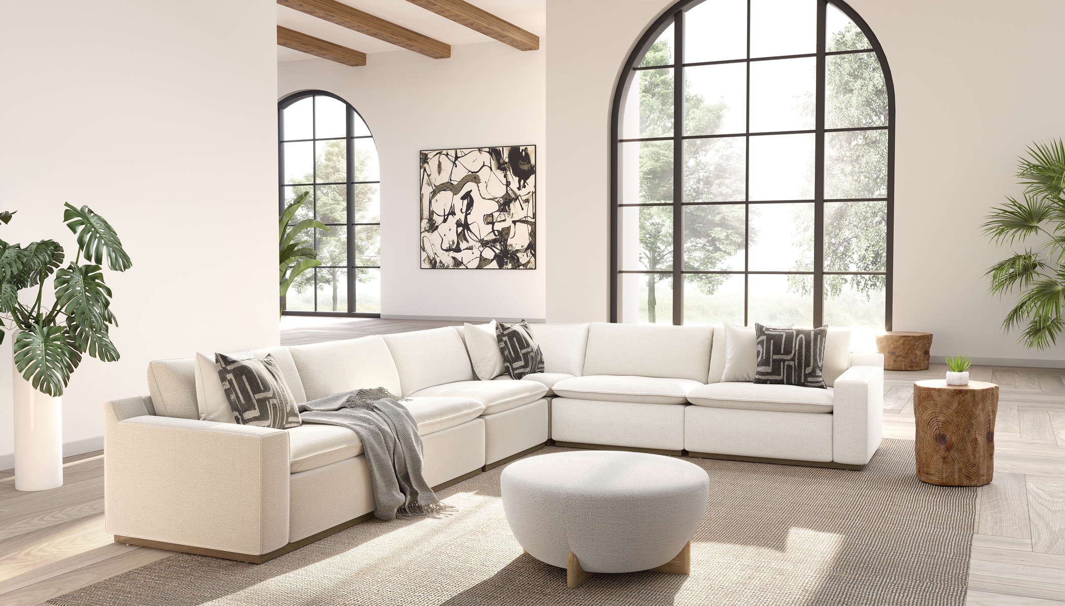
KUKA HOME's published categories offer another starting point for a cross-room furniture proposal. Ask for a composition that answers the same palette map, room dimensions and household priorities. Comparing two complete directions is more useful than placing one attractive sofa beside another unrelated bed photograph.
OPPEIN
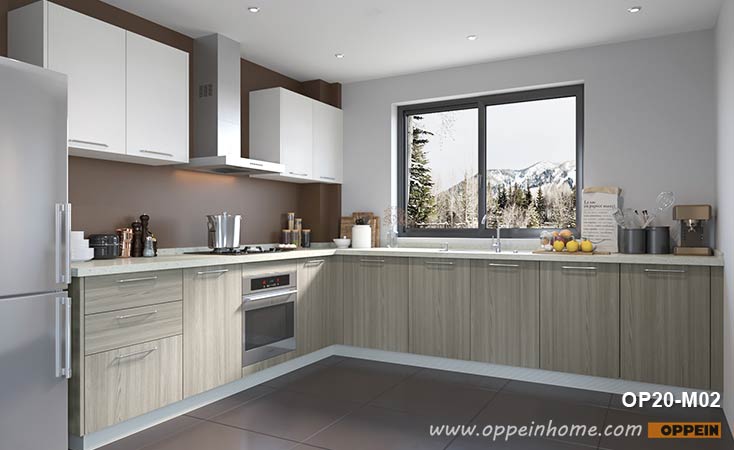
OPPEIN's whole-house scope is relevant when fitted surfaces shape the palette. If wardrobes, kitchen cabinetry or wall-adjacent storage dominate the home, involve that part of the proposal before finalizing movable furniture. The strongest palette may emerge from coordinating the two roles.
These candidates are included for their different possible contributions, not because this article has tested their products against one another. A supplier's published range helps identify whom to ask. The actual response determines whether the proposed furniture and services suit your project.
| Palette question | Furniture-led proposal | Fitted-led proposal | What to compare |
|---|---|---|---|
| What dominates the room? | Sofa, bed and dining pieces | Cabinetry and room-scale surfaces | Actual visual area and room constraints |
| How is continuity created? | Shape, upholstery and companion finishes | Repeated fitted finishes with movable accents | Samples and complete room views |
| Where can variation occur? | Secondary upholstery and occasional pieces | Loose furniture and selected feature surfaces | Which choices remain flexible |
Ask each supplier to explain one rejected option as well as its preferred option. The explanation can reveal whether the proposal is responding to your room or simply presenting a familiar showroom arrangement. A thoughtful rejection might identify an overly heavy form, an incompatible undertone or a practical conflict. Those reasons help you evaluate the advice without relying on unsupported ranking language.
A hypothetical warm, restrained apartment palette
Consider an apartment with warm timber flooring, pale walls and an existing dark dining sideboard. The owner wants a calm interior but does not want the rooms to feel empty or uniformly beige. This is an original design exercise, not a supplier project. The initial brief asks for a comfortable sofa, a dining table with chairs and an upholstered bed, while retaining the sideboard.
The first proposal uses pale upholstery on every soft piece and adds dark metal legs throughout. It looks coordinated in a sample sheet, but the repeated contrast makes the room feel sharper than intended. The owner keeps the sofa's quiet silhouette, changes the dining chairs to a warmer supporting tone and reduces the number of dark accents. The existing sideboard becomes the principal dark anchor.
The coffee table is then reconsidered. A strongly patterned top competes with both the floor and sideboard, so the comparison moves toward a quieter surface. This does not establish that quiet surfaces are always better. It shows how the role of an object changes when the surrounding materials are accounted for.
In the bedroom, the owner chooses a related upholstery undertone with a different texture. The bedside furniture repeats the warmth of the floor without trying to match it exactly. A simpler headboard allows the curtains and bedding to remain visually prominent. The bedroom now belongs to the same home while feeling less contrast-heavy than the living area.
The supplier decision comes after these relationships are tested. MLISSIA or another candidate would need to identify suitable actual products, the available finishes and the relevant dimensions. The successful proposal is the one that translates the palette into a coherent, usable selection, not the one that repeats the most persuasive style description.
Run a focused sample session
A productive sample session has a limited question. You might be deciding whether the sofa should sit close to the wall colour or provide a stronger contrast, or whether the dining table should repeat the sideboard's warmth. Gather the samples needed for that question and temporarily remove unrelated alternatives. This helps you compare complete relationships rather than becoming distracted by an attractive material with no defined role.
View the group in the room where it matters most. Move it near the floor, wall and existing furniture, then examine it under the lighting you normally use. Photograph the samples together for your own record, while recognizing that the photograph may not reproduce their exact appearance. Note what you observed in person and which combinations were rejected.
Keep a distinction between a representative sample and an approved final option. A small sample may demonstrate a colour family or texture without establishing the complete appearance of a large surface. Ask the supplier what it represents and how the final product will be identified. Where variation is expected, the record should explain that rather than imply an exact photographic match.
Choose a complete direction before fine-tuning minor accents. If the sofa, principal table and bed upholstery work together, smaller decisions become easier. If those major elements remain unresolved, selecting decorative metal colours or extra cushions can consume time without improving the room. The order of decisions should follow their visual importance.
At the end of the session, create one clear record of the selected group. Include the product reference, finish reference and intended room for each sample. Remove superseded options from the active discussion. This preserves the design intention and reduces the chance that a later quotation quietly returns to an earlier colour combination.
Keep restraint compatible with everyday life
A restrained interior should not require constant resetting to remain attractive. Consider where everyday objects will go and whether the selected furniture makes those routines easy. A coffee table may need a usable surface rather than a fragile-looking sculptural arrangement. A bedroom may need accessible bedside storage. A dining area may need a place for work materials that appear during the day.
Design the visible storage with the same care as the main furniture. An oversized storage unit can overwhelm a quiet composition, but too little storage can leave ordinary belongings scattered across every surface. The appropriate balance depends on the household. Ask the supplier to propose a realistic storage role rather than treating storage as an optional decorative extra.
Allow some personal variation. Books, artwork and retained objects can give a restrained room depth and meaning. The furniture should provide a coherent background for them, not demand that everything be replaced with matching accessories. This is especially important when a showroom image becomes the starting inspiration: your home does not need to reproduce the display to benefit from its design direction.
Plan for change as well. A chair may move to another room, a guest bedroom may become a study, or the dining area may serve several purposes. Furniture with a clear but adaptable visual language can accommodate those changes more easily than a composition that depends on every piece remaining in one exact position. Ask how the proposed range can be simplified or rearranged without losing its character.
The best minimalist palette is therefore not the most fragile one. It is a controlled set of relationships that remains convincing when people use the room. That is the standard against which a whole-home furniture proposal should be judged.
Check the palette against the room's changing light
A room does not remain under showroom lighting. Morning daylight, shaded corners and evening lamps can give the same furniture different visual emphasis. When choosing a restrained palette, those changes matter because subtle differences between surfaces carry much of the design. A sample group that looks almost uniform under one light may reveal competing undertones under another.
Observe the room before asking the supplier to settle the colours. Note where sunlight reaches the furniture, which areas remain darker and which artificial lights are normally used. This is a practical observation exercise, not a technical lighting calculation. It helps explain why a very pale sofa may suit one position while a slightly stronger tone works better in another.
View the selected samples in the important positions rather than only on a desk. Place the sofa sample near the intended seating area and the bed sample near the bedroom wall. If fitted finishes already exist, include them in the comparison. A proposed colour should be evaluated against the conditions in which it will be seen, not simply against the white background of a catalogue page.
Where the supplier provides a rendering, ask what it is intended to demonstrate. It can be useful for composition and contrast while remaining an approximation of material appearance. Do not turn a convincing rendering into an exact colour guarantee. Keep the physical or otherwise agreed sample reference as the material record and the rendering as a design communication tool.
If the palette becomes less convincing under ordinary evening light, consider adjusting one major surface before changing every item. A slightly different sofa undertone or a quieter table finish may resolve the conflict. The value of a controlled palette is that each change can be evaluated clearly. With too many unrelated finishes, it becomes difficult to identify what is causing the room to feel unsettled.
Read the supplier's presentation as a set of decisions
A polished presentation can make a furniture proposal feel complete before the important choices have been settled. Read it in layers. First identify the actual products, then the selected finishes, then the room arrangement. Decorative accessories, atmospheric lighting and broad style descriptions should support those decisions rather than substitute for them.
For each main item, ask whether the pictured configuration is the one being proposed. A sofa may be shown with different modules, a bed with a different headboard width or a table with a finish that has not been priced. These differences do not necessarily make the proposal unsuitable, but they should be resolved before the presentation becomes the reference for an order.
Next check whether the palette is consistent across pages. A sofa fabric can appear differently in a room rendering, a product image and a sample photograph. The supplier should identify the governing reference for the selected option. Otherwise, the household and supplier may both believe they have approved the same colour while referring to different images.
Finally, ask for a short explanation of the major relationships. Why does this dining chair belong with this sofa? Why is the bedroom upholstery different? Why is one table surface more prominent than the other? Clear answers indicate that the proposal has a coherent design intention. They also make later substitutions easier to assess, because you know which relationships should be preserved.
Keep the accepted presentation concise enough to use. A final selection document should distinguish approved items from inspiration and alternatives. The purpose is not to create a beautiful archive of every option considered. It is to preserve the decisions that make the proposed home coherent and to connect those decisions to the products that will actually be supplied.
Leave room for the objects that make the home personal
A furniture palette should support the objects you already care about. A painting, a collection of books or a retained chair may introduce colours and textures that are absent from the supplier's presentation. Include a few of those objects in the design discussion. They can reveal whether the proposed furniture provides a calm background or competes with the character already present in the home.
Do not try to make every personal object match the new furniture. Instead, decide where contrast is welcome and where a quieter surface would help. A restrained sofa can allow a colourful artwork to remain prominent; a simple bedside table can sit comfortably beside a distinctive lamp. The furniture's role is to create useful relationships, not to replace the household's preferences with a complete display.
This final check can also prevent unnecessary purchases. If a retained object already gives a room the warmth or emphasis it needs, another decorative piece may add little. A considered palette makes room for personal life while keeping the main product choices coherent.
Select a palette that can be specified and lived with
MLISSIA's Italian-minimalist positioning makes it a relevant candidate when your priority is a restrained furniture composition across living, dining and bedrooms. The next step is to request actual products that express that direction, then compare them through the same palette map and room plan. Style language earns attention; identifiable products and clear relationships earn a place in the final selection.
Keep the final recommendation specific. You may prefer a supplier because its proposed sofa shape works with the dining area, because its bed composition respects the existing fitted surfaces or because its available finishes form a coherent sample group. Those reasons are more useful than a broad claim that one brand is best for every home.
Before approving the order, review the complete palette without the presentation's decorative distractions. Check the dominant forms, the most visible surfaces and the ordinary use of each room. Confirm which samples and product references belong to the accepted direction. Any unresolved construction or service question should remain visible alongside the design approval.
Read our sofa-and-upholstered-bed collection comparison for the product relationships behind the palette, and the room-coordination guide for a broader furniture sequence. A convincing whole home comes from repeated, purposeful decisions rather than repeated colour names.
Sources and scope
Reviewed 27 October 2026. Palette methods, design observations and the apartment example are original editorial analysis, not supplier test results.
- MLISSIA About Us — official brand positioning; style does not establish manufacturing origin.
- Sina Home: MLISSIA brand feature — promotional company coverage, used only for attributed positioning.
- MLISSIA sofa category — official category page, not a complete model specification.
- KUKA HOME products — published range used as a comparison starting point.
- OPPEIN whole-house solutions — published scope relevant to fitted surfaces.
A complementary product and buying perspective
For a related decision, read From Showroom Evidence to a Whole-Home Furniture Shortlist in our companion publication. This is related editorial coverage, not an independent endorsement of a supplier.
Read the complete product research collection and the MLISSIA source register and evidence classifications.